R fridays #3: Delta-Delta CTs and ggplot2
Calculating \(\Delta\Delta\)Ct values and plotting with ggplot
Welcome back to R Fridays! Last week, we ended with calculating the first \(\Delta\)Ct from Sam’s qPCR data. Today, we will calculate the \(\Delta\Delta\)Ct and expression values. We will finish with plotting the results using the ggplot2 package.
How to Calculate \(\Delta\Delta\)Ct
To calculate the \(\Delta\Delta\)Ct, we first need to identify our control samples, and then calculate the mean \(\Delta\)Ct for those controls, for each target gene tested.
Sam’s data has 4 different samples: +1, -1, +2, and -2. The “+” and “-” refer to naive or cGAMP-stimulated cells. The 1 and 2 are different biological replicates.
So the control samples are -1 and -2; we first need to calculate the mean \(\Delta\)Ct of -1 and -2 for the two different targets that Sam tested (IFN and IFIT).
Let’s start by setting up new variables for the average control \(\Delta\)Ct for IFN and IFIT. We can put in the beginnings of a dplyr pipe-line, starting with the \(\Delta\)Ct data frame as input.
Control_average_IFN <- sams_data_deltaCT %>%
  #We will fill in the rest of the pipe-line here

Control_average_IFIT <- sams_data_deltaCT %>%
  #We will fill in the rest of the pipe-line here
Now that we have our pipe-line template set up, we can start adding some dplyr verbs to pull out specifically the control samples. We know the control samples all have “-” in their Sample Name, so we can use filter() and str_detect() to isolate these samples.
Control_average_IFN <- sams_data_deltaCT %>%
  filter(str_detect(`Sample Name`, "-"))
  #We will fill in the rest of the pipe-line here

Control_average_IFIT <- sams_data_deltaCT %>%
    filter(str_detect(`Sample Name`, "-"))
  #We will fill in the rest of the pipe-line here
Open the table using the RStudio viewer to check that the only samples in the new table are control samples.
We need to calculate the average for IFN and IFIT separately, so now let’s filter() by the Target column.
Control_average_IFN <- sams_data_deltaCT %>%
  filter(str_detect(`Sample Name`, "-")) %>%
  filter(Target == "IFN")
  #We will fill in the rest of the pipe-line here

Control_average_IFIT <- sams_data_deltaCT %>%
  filter(str_detect(`Sample Name`, "-")) %>%
  filter(Target == "IFIT")
  #We will fill in the rest of the pipe-line here
Great! Notice that we used to two calls to filter() in a row. We could combine these into a single filter() call like below. Sometimes this makes code look cleaner, other times it may help to see each filtering step separately– it’s up to you to decide what makes your code easiest to read.
Control_average_IFN <- sams_data_deltaCT %>%
  filter(str_detect(`Sample Name`, "-") & Target == "IFN")
  #We will fill in the rest of the pipe-line here

Control_average_IFIT <- sams_data_deltaCT %>%
  filter(str_detect(`Sample Name`, "-") & Target == "IFIT")
  #We will fill in the rest of the pipe-line here
Next, we can calculate the mean() of the \(\Delta\)Ct values in each data frame. For the next steps, it will be easiest if the means are stored as individual values rather than in data frame form. To pull out a column so that we can calculate and save a single summary value, we will use the pull() function to pull out the deltaCT column.
Control_average_IFN <- sams_data_deltaCT %>%
  filter(str_detect(`Sample Name`, "-") & Target == "IFN") %>%
  pull(deltaCT) %>%
  mean()


Control_average_IFIT <- sams_data_deltaCT %>%
  filter(str_detect(`Sample Name`, "-") & Target == "IFIT") %>%
  pull(deltaCT) %>%
  mean()
Perfect! Now we have the mean \(\Delta\)Ct values for our control samples. Notice that when the result of the pipe-line was a single value instead of a table, the Control_average_IFN and Control_average_IFIT variables jumped from the Data to the Values section of the Environment pane at the top right of the RStudio window.
The last step is to calculate \(\Delta\Delta\)Ct for the cGAMP treated samples based on the control values we calculated. We want to make a new column based on a calculation using an old column, so we will use the mutate() verb. Since there is a different control value for each target, we can use the case_when() call inside mutate() to tell R how to handle each Target.
deltadeltaCT <- sams_data_deltaCT %>%
  mutate(ddCT = case_when(
    Target == "IFIT" ~ deltaCT - Control_average_IFIT,
    Target == "IFN" ~ deltaCT - Control_average_IFN
  ))
I’ve decided to make a new data frame here called deltadeltaCT. You could just add the \(\Delta\Delta\)Ct calculation onto the pipe that we made last week, but I felt that this was a reasonable place to make a new data frame; sometimes longer pipe-lines can become difficult to interpret.
Calculating Expression values
Now we can finally calculate expression values! This step is much less complicated– we just need to make a new column with mutate() containing the result of 2 raised to the power of the negative \(\Delta\Delta\)Ct value.
sams_data_expression <- deltadeltaCT %>%
  mutate(expression = 2^(-ddCT))
Plotting with ggplot2
ggplot2 is a package that is a “core” part of the tidyverse. This means we can start using ggplot2 right away, since we loaded the tidyverse at the beginning of the session.
To make a ggplot, we can use the ggplot() function. The first argument is the data frame we want to plot. The next argument is a series of aesthetic mappings, specified with aes(). These are things like the x and y values of the plot, or groups in the data.
For our data, the x values would be the Target column, and the y values would be the expression column from the data frame sams_data_expression.
ggplot(sams_data_expression, aes(x = Target, y = expression))Next, to tell ggplot() what kind of plot to make (scatter plot), we add the specification geom_point() using the + operator. The + operator is kind of like the pipe operator (%>%) in that you use it to build on to the code that came before it– but this is not a perfect analogy. The + is used to add layers to plots with ggplot(); the pipe (%>%) operator sends the result of the left side of the pipe as the first argument on the function on the right side.
ggplot() makes different kinds of plots using different geometries. So we can specify a scatter plot using the point geometry (geom_point()). Some other common geometries are geom_boxplot(), geom_bar(), and geom_line().
ggplot(sams_data_expression, aes(x = Target, y = expression)) +
  geom_point()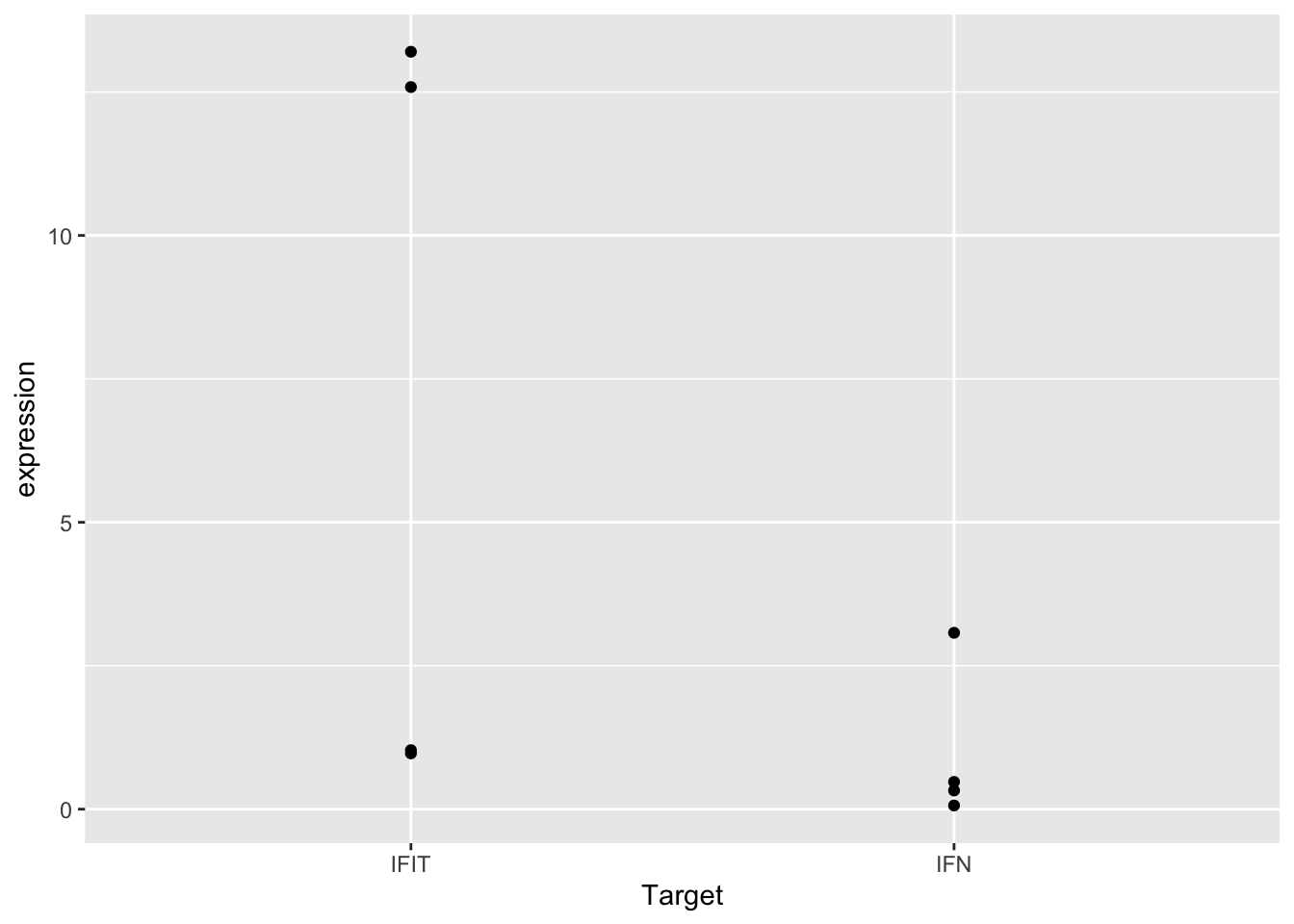
This plot shows our data… but not in the most useful format. It’s impossible to tell which points come from the control or cGAMP-treated samples. It also looks like some points are plotted right on top of one another, making it hard to see the exact location of all the data points.
To address the first issue, we can add a variable to the plotting data frame for control or cGAMP-treated samples. We can then use this variable to tell ggplot() that our data has different groups.
To make the new column, use mutate(), case_when(), and str_detect():
sams_data_expression <- sams_data_expression %>%
  mutate(SampleType = case_when(
    str_detect(`Sample Name`, "-") ~ "Control",
    TRUE ~ "cGAMP-Treated"
  ))
Now tell ggplot2 to color the points by our grouping variable by adding color = SampleType to the aes() in the ggplot() call:
ggplot(sams_data_expression, aes(x = Target, y = expression, color = SampleType)) +
  geom_point()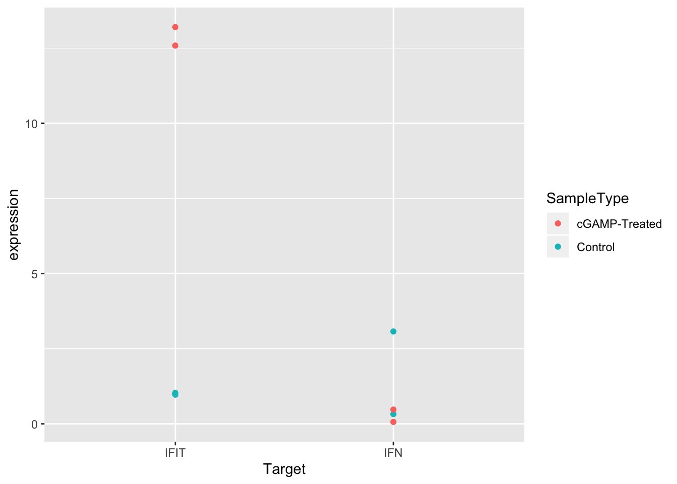
Much better! But it would be even easier to see the differences between control and treated samples if the points were separated in the plot. We can do this by setting the position argument in geom_point() to position_dodge() with a width of 0.3.
ggplot(sams_data_expression, aes(x = Target, y = expression, color = SampleType)) +
  geom_point(position = position_dodge(0.3))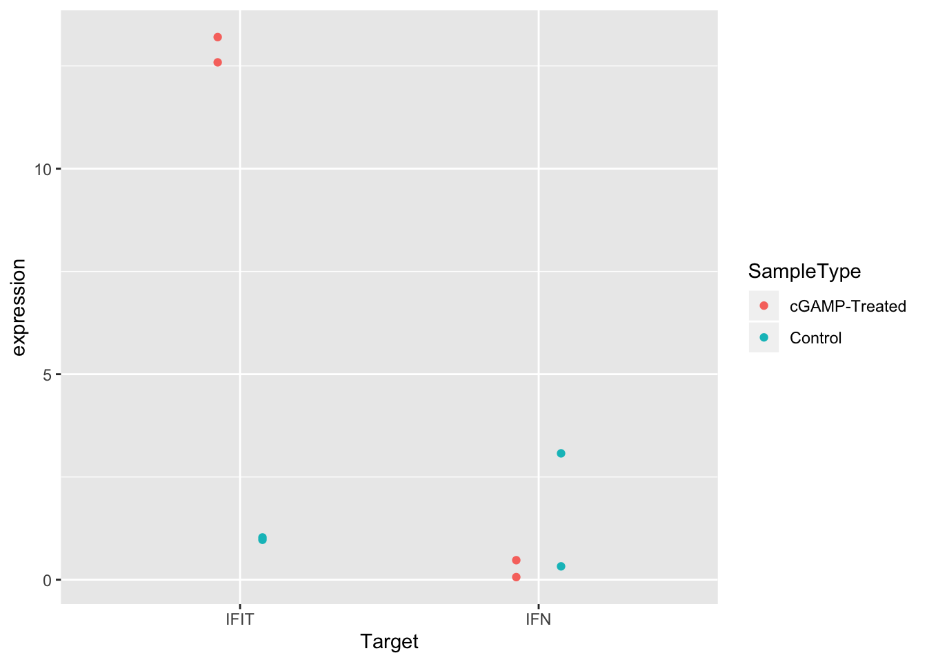
Another solid improvement. But it’s still hard to see some of the overlapping points. There are actually two good solutions to this issue.
- We can change the transparency of the points using
alpha. - We can add some random noise to the points so they spread out by using
jitterdodge()in ourpositionargument.
Let’s try to first option, setting alpha to 0.5:
ggplot(sams_data_expression, aes(x = Target, y = expression, color = SampleType)) +
  geom_point(position = position_dodge(0.3), alpha = 0.5)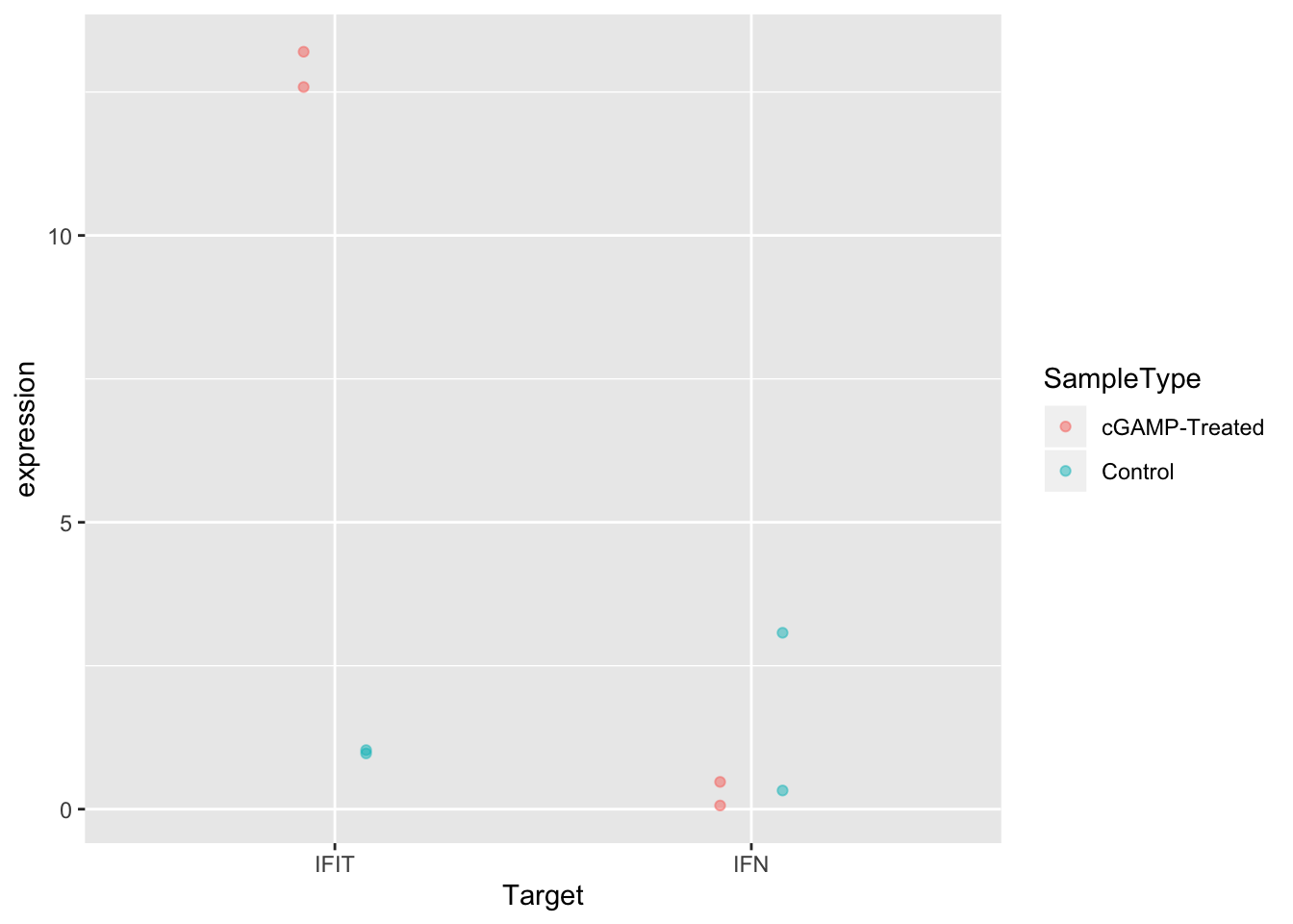
And now the second option:
ggplot(sams_data_expression, aes(x = Target, y = expression, color = SampleType)) +
  geom_point(position = position_jitterdodge(0.2))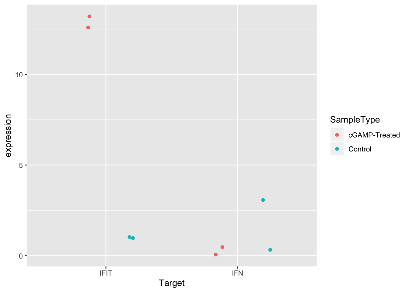
Great! Either of these two options improves the visualization. Pick whichever you like best. Sometimes if there are many points, it can be useful to use both strategies together.
Before we leave, let’s try specifying different shapes for each group instead of different colors. This is as simple as changing the aesthetic mapping from color = SampleType to shape = SampleType.
ggplot(sams_data_expression, aes(x = Target, y = expression, shape = SampleType)) +
  geom_point(position = position_dodge(0.3), alpha = 0.5)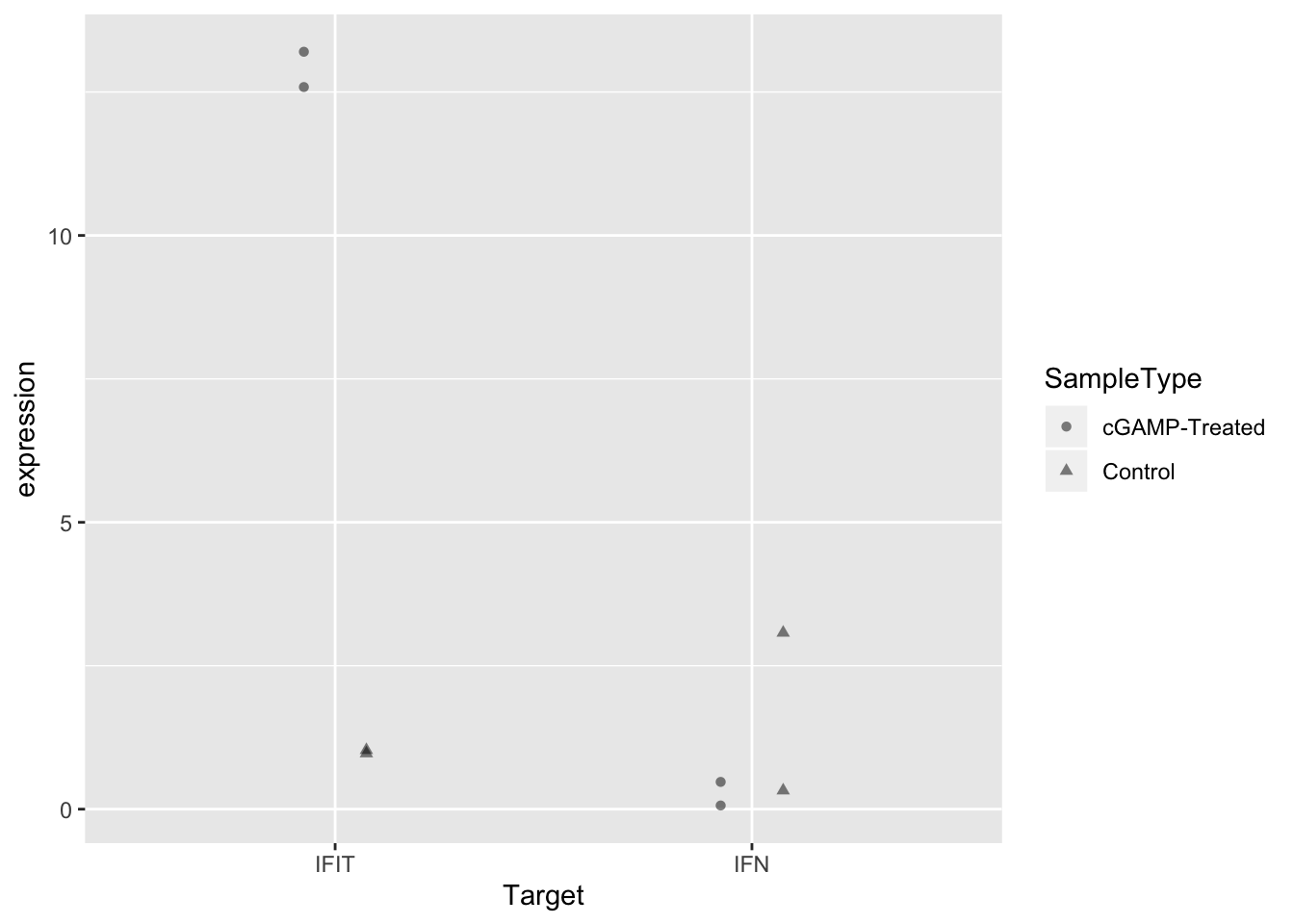
Wrap-up
Today, we calculated expression values from Sam’s qPCR experiment and visualized the data in a scatter plot. From the plot, it’s clear that treatment with cGAMP led to up-regulation of IFIT expression, but not IFN expression.
Since there were only two biological replicates, we can’t calculate statistics from this data– and just by visualizing the data we can make plenty of useful conclusions.
One explanation for the lack of IFN up-regulation could be that some of Sam’s CT values were close to the upper end of the detection limit for qPCR. Next week we will move on to a different data-set, but a next step for Sam could be to add color or text to her plot to note which points had CT values that were suspect.
As always, if you have any questions don’t hesitate to email me.