R fridays #4: Analyzing MaxQuant proteomics data
Processing proteomics data from MaxQuant
The data we analyzed today was simulated from an LC-MS/MS analysis of the human RNA-binding proteins that directly interact with incoming RNA virus genomes. You can use this link to see more about how this data was generated (manuscript under review).
We tested three different timepoints and 2 different treatment conditions (+ and - interferon/IFNB1). For these conditions, we have three biological replicates. We also have two control biological replicates for each condition. Here is a summary of all the samples:
Experimental Conditions
3 replicates each
- 0 hours post infection (hpi), +IFN pretreatment
- 1 hpi, +IFN pretreatment
- 3 hpi, +IFN pretreatment
- 0 hpi, untreated
- 1 hpi, untreated
- 3 hpi, untreated
Control Conditions (called “no4SU” in the data)
2 replicates each
- +IFN pretreatment
- untreated
The raw LC-MS/MS data was processed using MaxQuant (Cox and Mann (2008)), which outputs a table of peptide-spectrum matches called proteinGroups.txt. Today, we will:
- Read in proteinGroups.txt
- Plot the distribution of raw MS1 ion intensities
- Color the plot by the timepoint tested
These plots will help us determine whether the MS1 ion intensities are distributed normally, and whether they can safely be used as a semi-quantitative measure of protein abundance.
Reading in proteinGroups.txt
First, let’s load the tidyverse package to our R session.
library(tidyverse)Next, we can use the read_tsv() function to read the data from proteinGroups.txt into R
mq_full <- read_tsv("../../data/maxquant_072619.tsv")## Parsed with column specification:
## cols(
## .default = col_double()
## )## See spec(...) for full column specifications.Wow! That’s a lot of columns. Today we will only be plotting the MS1 ion intensity data, so let’s select only the Intensity columns and the column with the Protein IDs. We also want to specify that we want the raw Intensity columns, not the “LFQ” (Label-Free Quantification) Intensity columns.
mq_intensities <- mq_full %>%
  select(`Majority protein IDs`,
         contains("Intensity "), -contains("LFQ"))
Next, let’s remove proteins that MaxQuant has labeled as “contaminants” using the CON_ prefix in the Majority protein IDs column. We can also remove proteins with the prefix REV_ : these are proteins from the database of reversed protein sequences that MaxQuant uses to estimate a false-discovery rate for peptide-spectrum matches. We can add these filtering steps to the existing pipe from the previous step
mq_intensities <- mq_full %>%
  select(`Majority protein IDs`,
         contains("Intensity "), -contains("LFQ")) %>%
  filter(!str_detect(`Majority protein IDs`, "CON") &
         !str_detect(`Majority protein IDs`, "REV"))
Great! 23 columns is much easier to work with than 231. For plotting our data though, it will be more useful to reformat our data into a “tidy” format with one observation per row (for a more detailed explanation of tidy data, see this excellent blog post. We can accomplish this using gather() to gather the column names (keys) into a Sample column, and the intensities (values) into an Intensity column.
mq_intensities <- mq_full %>%
  select(`Majority protein IDs`,
         contains("Intensity "), -contains("LFQ")) %>%
  filter(!str_detect(`Majority protein IDs`, "CON") &
         !str_detect(`Majority protein IDs`, "REV")) %>%
  gather(Sample, Intensity, -`Majority protein IDs`)
Plotting the distribution of raw MS1 ion intensities
To plot the intensities, we can construct a kernel density plot using ggplot2 and the geom_density() geometry. A kernel density plot only requires one aesthetic mapping: x = Intensity. We will also add the mapping color = Sample to draw one density for each Sample. Lastly, we can make the densities transparent by setting alpha = 0.6 inside geom_density().
ggplot(mq_intensities, aes(x = Intensity, color = Sample)) +
  geom_density(alpha = 0.6)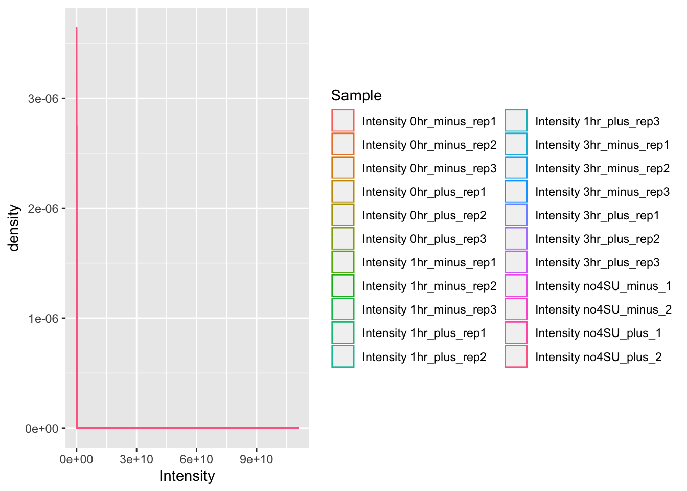
It’s difficult to tell what is going on in this plot, since most of the observations seem to have a low intensity, but there are also observations with very high intensity. We can address this by log-transforming the data within our call to ggplot:
ggplot(mq_intensities, aes(x = log10(Intensity), color = Sample)) +
  geom_density(alpha = 0.6)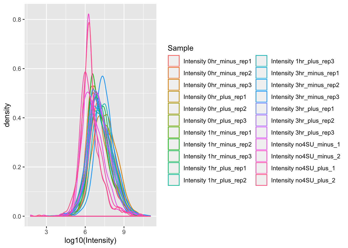
Beautiful! But there are still some problems with this data visualization. Right now, we have a different color for each individual replicate that we tested. It would be more useful if we had a different color for each timepoint that was tested (or control).
We are also plotting both the +IFN pretreated and untreated samples on the same plot. Comparing both a condition and a time-course in the same plot can be overwhelming, so let’s make two separate plots for the +IFN pretreated and untreated samples.
Coloring the plot by the timepoint tested
First, let’s add a new column called Timepoint to group the data by timepoint or control.
mq_intensities_timepoints <- mq_intensities %>%
  #Remove the word Intensity from the Sample column
  mutate(Sample = str_replace(Sample, "Intensity ", "")) %>%
  #Change "no4SU" to "Ctr" to make it clear that it is the control
  mutate(Sample = str_replace(Sample, "no4SU", "Ctr")) %>%
  #Make a new column called Timepoint
  mutate(Timepoint = str_sub(Sample, 1, 3))
Perfect. Now we can split the dataframe into two, one for +IFN pretreatment, and one for untreated:
mq_intensities_minusIFN <- mq_intensities_timepoints %>%
  filter(str_detect(Sample, "minus"))

mq_intensities_plusIFN <- mq_intensities_timepoints %>%
  filter(str_detect(Sample, "plus"))
Now let’s make two kernel density plots, and color the densities by Timepoint. Since we want ggplot to color by Timepoint but draw a KD for each replicate, we also have to specify the aesthetic mapping group = Sample. To make it clear which plot is which, let’s also add a title to the plot using labs().
ggplot(mq_intensities_minusIFN, aes(x = log10(Intensity), color = Timepoint, group = Sample)) +
  geom_density(alpha = 0.6) +
  labs(title = "KD plot of raw MS1 ion intensities (untreated samples)")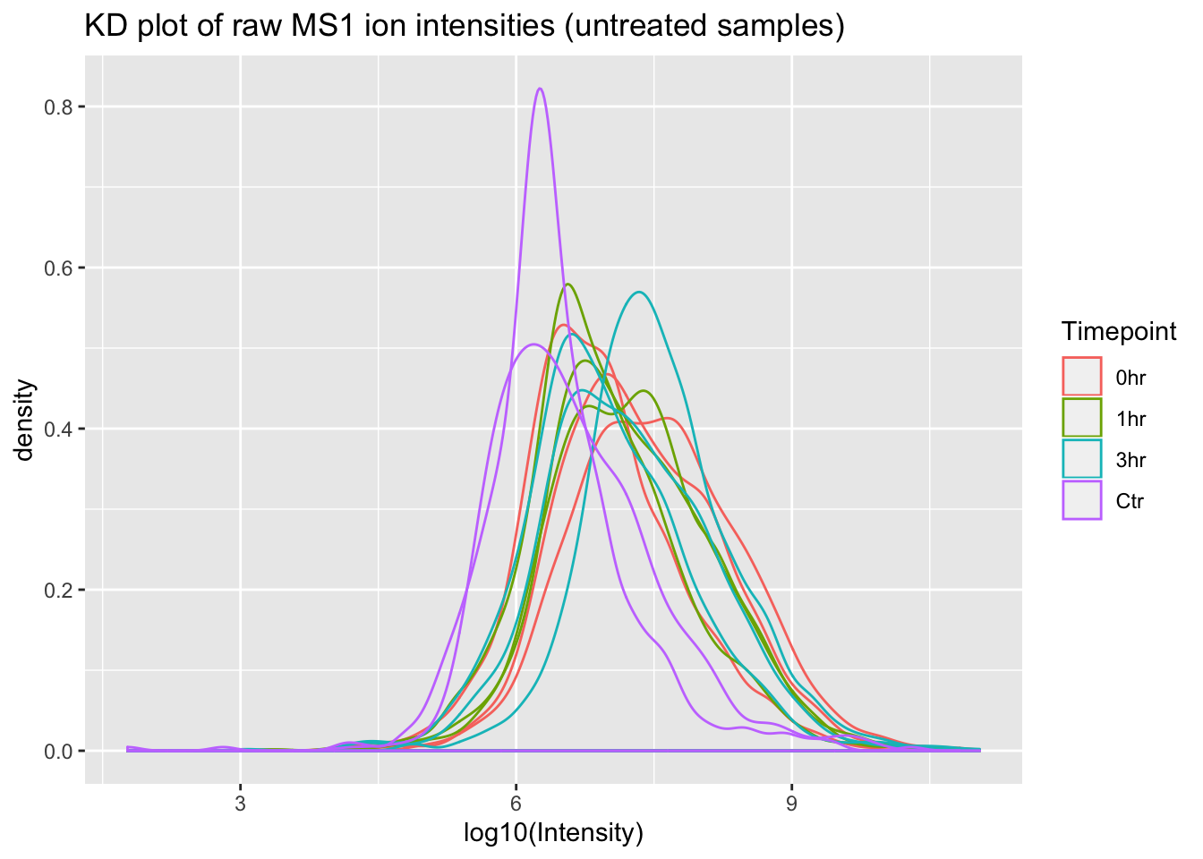
ggplot(mq_intensities_plusIFN, aes(x = log10(Intensity), color = Timepoint, group = Sample)) +
  geom_density(alpha = 0.6) +
  labs(title = "KD plot of raw MS1 ion intensities (+IFN pretreated samples)")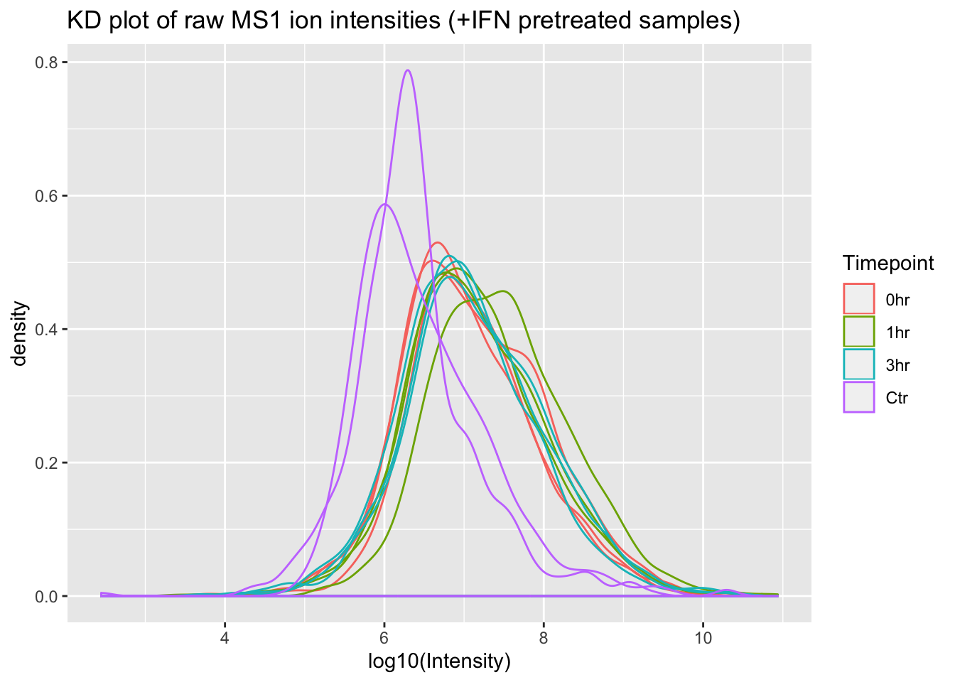
Great! From these plots we can see that the control (Ctr) samples have consistently lower MS1 ion intensities than the experimental samples. This might invalidate some of the assumptions in the LFQ algorithm that MaxQuant uses, so using this data to estimate protein abundance would not be straightforward.
One more thing before we go: to see the +IFN treated and untreated samples in separate plots above we split the actual dataframe into two separate dataframes. ggplot2 has a useful function called “faceting” that would allow us to keep all of our data in a single dataframe.
Let’s use the facet_wrap() function to plot our data from a single dataframe. First, we need to add another grouping column to specify +IFN pretreatment or untreated.
mq_intensities_facets <- mq_intensities_timepoints %>%
  mutate(Treatment = case_when(
    str_detect(Sample, "minus") ~ "Untreated",
    str_detect(Sample, "plus") ~ "+IFN Pretreated"
  ))
Now let’s build the ggplot and add a facet_wrap() layer
ggplot(mq_intensities_facets, aes(x = log10(Intensity), color = Timepoint, group = Sample)) +
  geom_density(alpha = 0.6) +
  facet_wrap(~Treatment)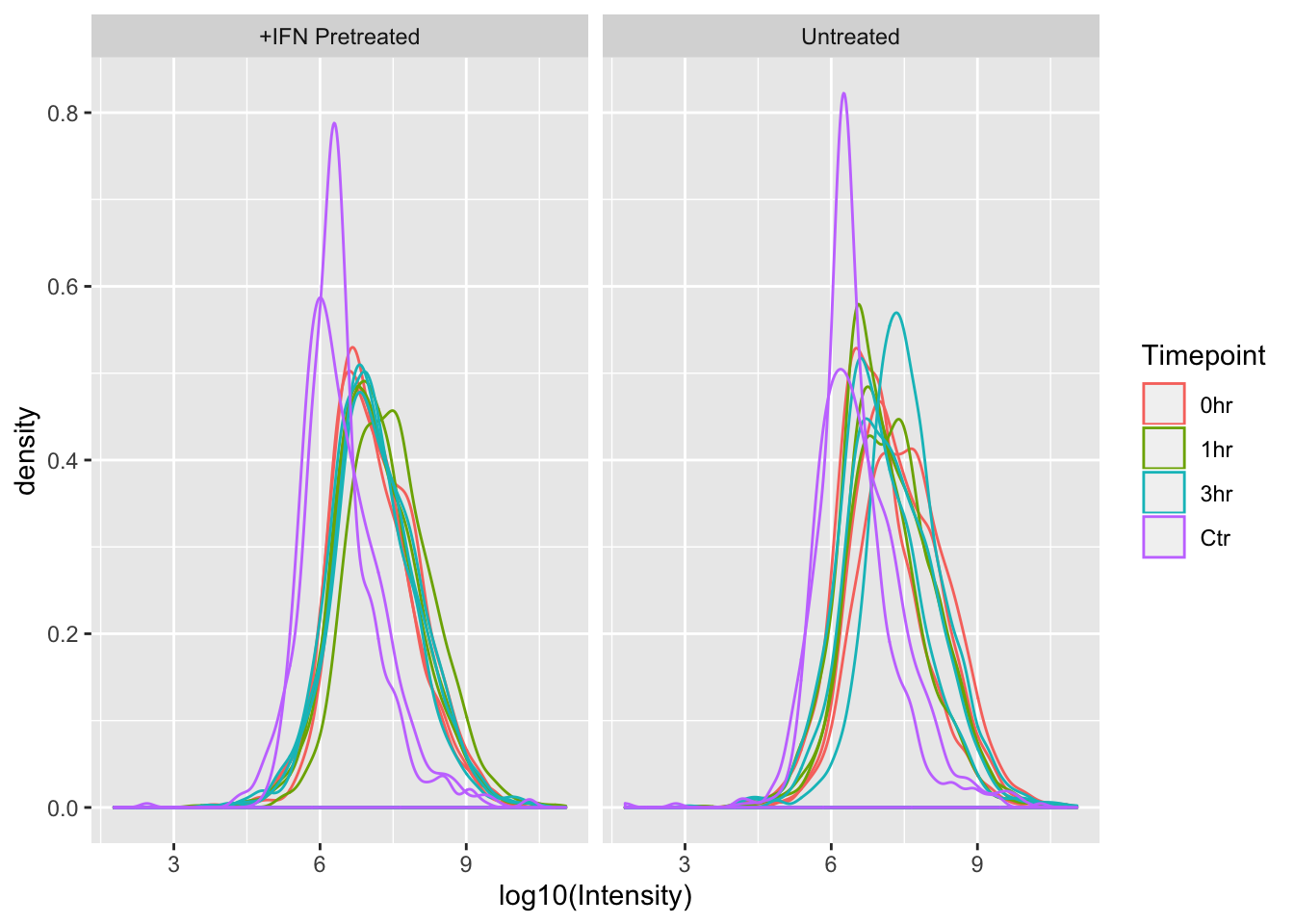
With distribution plots, it can be more useful to compare across the x axis than the y, so we can use the nrow argument in facet_wrap() to force ggplot to show the +IFN Pretreated and Untreated plots on top of one another, rather than next to one another.
ggplot(mq_intensities_facets, aes(x = log10(Intensity), color = Timepoint, group = Sample)) +
  geom_density(alpha = 0.6) +
  facet_wrap(~Treatment, nrow = 2)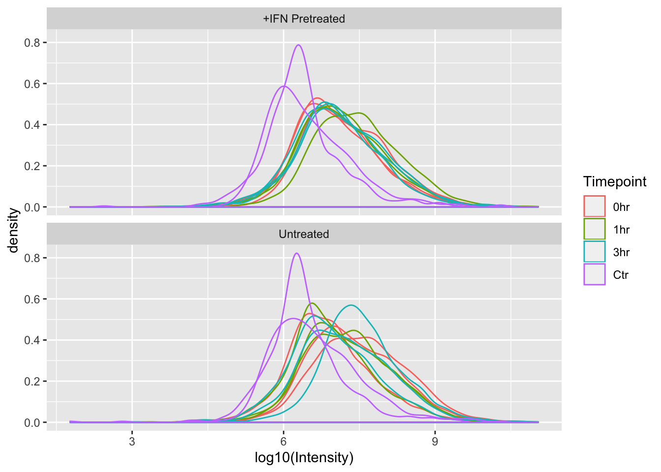
Since the x-axes for the plots are the same scale, we can now easily see that the distributions of Intensities between +IFN Pretreated and Untreated are fairly similar.
Wrap Up
Woo! Here is what we accomplished today:
- Read MaxQuant proteomics data in to R
- Plotted the distribution of the data using a kernel density plot
- Separated the plots into +IFN pretreated and untreated samples
- Colored the kernel densities by the Timepoint tested
- Hypothesized that the MaxQuant LFQ algorithm will not accurately estimate protein abundance with this dataset.
- Used
facet_wrap()to plot both +IFN pretreated and untreated samples separately but in the same ggplot.
As always, if you have any questions don’t hesitate to email me.
Cox, Jürgen, and Matthias Mann. 2008. “MaxQuant enables high peptide identification rates, individualized p.p.b.-range mass accuracies and proteome-wide protein quantification.” Nature Biotechnology 26 (12): 1367–72.