R fridays #8: PRO-seq and heatmaps
Looking for patterns in PRO-seq with heatmaps
Traditional RNA-seq measures RNA levels which are the result of both transcription and degradation of mRNA transcripts. Monica Bomber and Hillary Layden of the Hiebert Lab use PRO-seq (precision nuclear run-on sequencing) to directly measure gene transcription rates. PRO-seq can measure transcription rates and identify transcription start sites at high-resolution througout the genome. Today, Monica and Hillary showed us how to generate a heatmap to understand how transcription rates change over time in a human B cell lymphoma cell line. Take a look at the approach and simulated data below.
The experiment
The Hiebert lab is interested in changes in transcription after depletion of a protein called FOXO1 in human B cell lymphoma cells (DHL-4). Hillary and Monica used the dTAG system to degrade FOXO1, and then measured changes in transcription over time. They looked at 5 timepoints after degradation of FOXO1 (0.5 hours, 1 hour, 2 hours, 6 hours, and 24 hours).
Reading in the data
The data was read in using read_csv() from the tidyverse.
library(tidyverse)proseq <- read_csv("../../data/proseq_082319_noise.csv")## Parsed with column specification:
## cols(
## `Transcript ID (duplicates removed)` = col_double(),
## `0.5 hrs` = col_double(),
## `1 hr` = col_double(),
## `2 hrs` = col_double(),
## `6 hrs` = col_double(),
## `24 hrs` = col_double()
## )This table contains the log2-transformed expression values for the untreated cells and for each timepoint after degradation of FOXO1.
Making a heatmap with pheatmap
Monica and Hillary wanted to look for patterns in trancriptional changes over the course of their experiment. To do this they used the pheatmap package to draw a heatmap and the RColorBrewer package to pick aesthetically pleasing colors.
library(pheatmap)
library(RColorBrewer)
First, they removed the first column of their data, which contains gene names.
proseq <- select(proseq, -contains("Transcript"))Next they specified the color gradient to use for the heatmap
my_palette=colorRampPalette(rev(brewer.pal(n = 11, name = "RdYlBu")))(1000)Finally they generated a heatmap using the pheatmap() function from pheatmap.
pheatmap(proseq,
         color = my_palette,
         cellwidth = 60,
         cellheight = 2,
         cluster_cols=F,
         cutree_rows=7,
         scale="row",
         fontsize_row=2)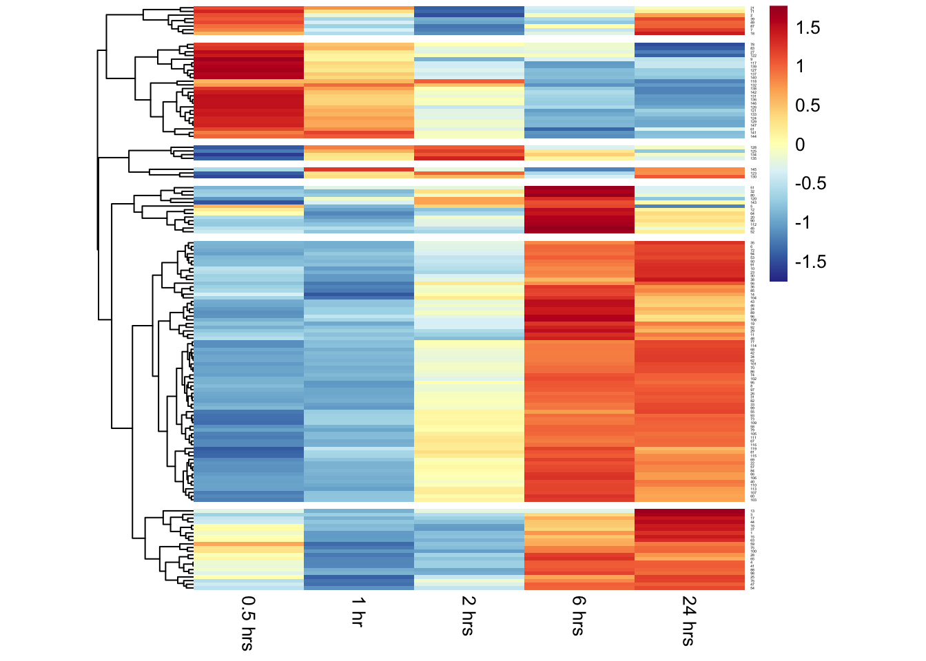
By default the pheatmap() function performs hierarchical clustering on the input data before drawing the heatmap. From the clustering and the visualization, there are clear patterns of genes that have increased or decreased transcriptional activity over time after depletion of FOXO1.
The pheatmap() function has many options to customize heatmaps, like adding annotations to the cells and using different clustering algorithms (like k-means). Dave Tang recently wrote an excellent blog post going into more detail about using pheatmap() to examine RNA-seq data.
Wrap-up
Today was a short introduction to drawing heatmaps to look at time-series data. In the future we will go into more detail about different kinds of clustering and when it is appropriate to use them.
As always, if you have any questions don’t hesitate to email me.